I considered showing a new 'Lass' culture, mocking modern lad cultures, by showing different stereotypes of women such as pin up models, androgynous dress and 'butch' looking women. I thought of an idea where I could portray powerful women through history and have the slogan 'Lass' next to them; to make them seem more like role models of todays modern culture.
After a tutorial with Eleanor we decided that the best idea to go with would be gender neutral toys as this would be an image that would get across a message without having to add any text to it. Showing genders playing with toys that are stereotypical to the opposite.
More contextual references

I think this is pretty similar to my approach to working digitally and the kind of text style I have started to form

Typography

This is a lovely composition and I like the typography used also

I like the thought of adding really hand written text

Poster for equality, I like the idea of layering the genders

Character design

Simplistic poster for equality. Red is seen as an equal colour here

Poster design - limited colour palette

Feminist colouring book

Posters for toys
Colouring


After a tutorial with Eleanor she felt that the images would work alone without text, and that I should consider the facial expresions of the charcters more to look more happy about the situations. She said that I should also consider my colour pallette more. I told her that I was becoming interested in old fashioned toy posters, 1940s-1960s childrens posters. I like the style of these; I don't wish to replicate them but I think certainly taking influence from the colour scheme will help my work. I think that this will also reflect my concept that I feel these sexist remarks and this whole opinion of gender in todays modern culture is old fashioned and we are going back on ourselves. I think showing these modern situations in quite an old fashioned manner could prove interesting.
I went back into some of my drawings and changed them to be more old-fashioned. I used reference imagery from the 1960's to get an idea of clothing, hairstyle and colour.

1st Design
I then came across this fisher price poster which I liked and decided to use that old fashioned font and add a hint of sexism to it


Two that I am happy with
1st Design

2nd Design

One that went wrong
It's hard to draw children smiling without looking really creepy. I battled with this one all day but I am just not happy with it so won't be using it
I have enjoyed sourcing my colour pallette from 1960's imagery of toddlers and posters because I feel this gives my work more context than how I usually colour realistically true to life. This will be something I consider more in the future.
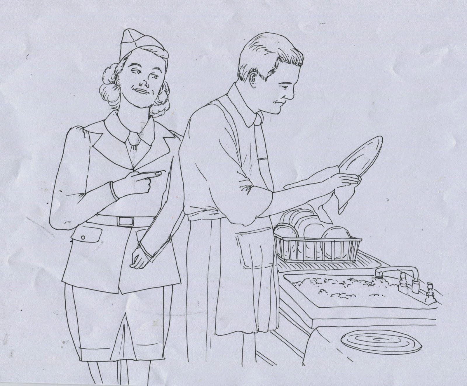
After a quick tutorial with Eleanor she felt that the two posters worked in saying what I need to say about gender neutral toys and added that I may now wish to move onto adults in the workplace and at home in the different gender roles. I really liked this idea because it allows me to explore more of my essay points.
I am still researching into feminism as I am finalising my designs to stay passionate about the subject.
This was an interesting video I found about whether the word feminism is a negative connotation compared to equality.
http://thelibertarianrepublic.com/girl-explains-why-shes-not-a-feminist-guess-why/
http://thelibertarianrepublic.com/girl-explains-why-shes-not-a-feminist-guess-why/
A couple more designs I could use if they were edited

A couple more designs I could use if they were edited
No comments:
Post a Comment