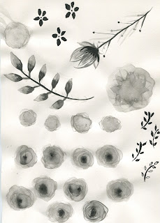
When looking into feminine products I decided ink and brush would be best for creating a pattern. In particular for floral patterns, because my digital attempt was rather shocking!
I took certain sections from this and repeated them into a pattern
I then tried laying colour over them
I put the logo over the top and tried different colours for it to stand out more
I figured the logo would need to be within a white space because no colours were suiting.
This wasn't working. I went back to my design and decided to re lay the flowers out again and tried to make a pattern with all of my favourite ones together on a page
I really liked this. I played with the opacity and layering colour over it. I then added a white band along the centre to put the font inside.
Mock up
I had a look to see what it would look like on a net that I found online, but it printed out really pixelated as the net was far too small.


No comments:
Post a Comment