Thursday 26 November 2015

Practical - Femitooth - toothpaste for her

Femitooth is the name for the ladies brand because it's quite uncomfortable when femi is put in front of a product it reminds me of feminine wipes or a femidom… so I think its very mocking of feminine products.

I want a catchy slogan underneath but I haven't figured that out yet, something about independent ladies who can brush on their own

This is just a rough idea of what a net would look like I've tried to incorporate a design onto it but it's not what I'll be going for, looks very dated, I just wanted to get an idea of how the design would be layed out. I think with a pattern like this that has to be continuous it's going to be harder to figure out how to join the sides together.
Further experimentation

I've began looking at other colour palettes, this one being pastel colours to represent femininity. Trying out other patterns with shapes I can create on Photoshop rather than flowers because I am not very good at drawing them digitally! Ideally I wanted diamonds but the pentagon was easy because it was already made up. 


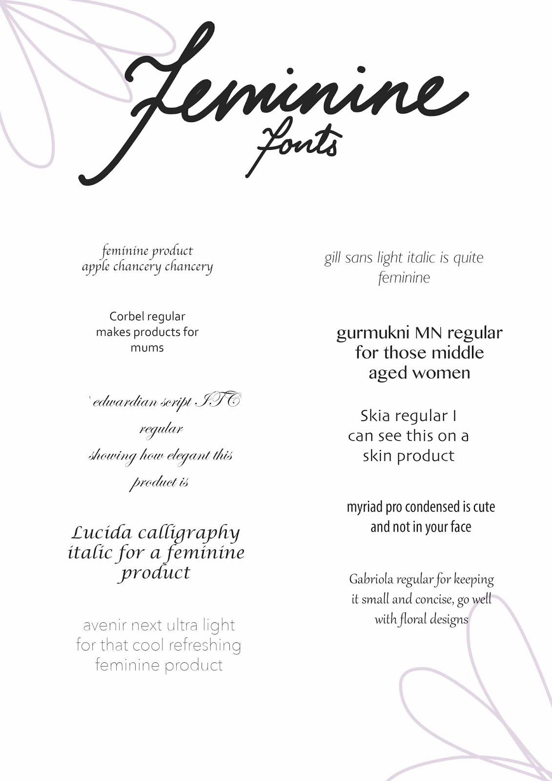
I tried out some different fonts that would be seen on toiletries, something that looked clean and fresh but still feminine rather than calligraphic.


Tried out adding more colour to the shapes but they looked too vibrant


Final


Trying the floral pattern with this font

I thought i'd change up the pattern and try this floral one but it looks very dated I feel 


Maybe it is the colour? I am not sure... 


Final for that design :

This is the final design I came up with for that after playing around with colour but I'm still not happy with it, it doesn't say toothpaste to me.. maybe that's my point though? 


3rd design idea :


Practical - Contextual research feminine packaging


Trying some patterns myself


Practical - Floral pattern for packaging


PROBLEM 

I CAN'T DRAW FLOWERS DIGITALLY
Looking at female products there are a lot of floral designs so I have decided to experiment creating some to add onto the packaging. However, I feel that the more successful floral patterns are done in ink or paint and have a really nice texture and marks to them. Before experimenting with that I have tried some digital designs. Colouring them doesn't seem to work, it seems less is more for this. I am not happy with any of these outcomes, they don't look right at all. However, I decided to at least take one and try make something of it or it would be a waste


I think less is more with regards to this, not using colour will look more affective on packaging


Here I tried to be a lot looser with my lines with influence from other floral designs I'd seen


Putting one of them into a pattern design


Experimenting with the elipse tool for logo


I had a play around with how it would look on a net


Written - The psychology of store layout

http://www.moneycrashers.com/retailers-impulse-buys-store-layouts/

Perhaps I could use this idea within my practical work, maybe mock up a store layout of how exaggerated you can be to point someone in the direction of their gender? - synthesis

Written - Stastistics. Statista Dossier


Written - Bic pens for women - Ellen

https://www.youtube.com/watch?v=eCyw3prIWhc

Watching this I decided to contact ellen and just ask about how she felt about bic further and whether she got an apology after her outrage. More than that what she feels about gendered products in general

Written - Procter & Gamble - Gillette response


Written - Case study research - Contacting razor companies

Gilette

 I decided to keep it short for now and then I can ask more questions later, I didn't want to put them off


Good morning,

I was wondering if I could ask a couple questions to help with my dissertation research?
I would like to know the reasoning behind your marketing segmentation method of using both male and female gillette products; in place of just one gender neutral razor? Is there a real difference between the two? Do you find yourself under scrutiny of being sexist by segregating a product into different genders?

Any information regarding this would be incredibly helpful
Thank you for your time

Adele Pierce
Illustration


Bic

I have contacted bic previously, but I emailed again to ask the same question as above


I also looked for anyone that worked for bic in the marketing department or any directors on LinkedIn, and the same for gilette, to see if I could get any inside information rather than through the website

Facebook

I noticed the companies on Facebook so unboxed the questions to that as well and hopefully will get a reply from someone

Monday 23 November 2015

Written - Vance Packard - The hidden persuaders (notes)


  • page 31 - the use of mass psychoanalysis to guide campaigns of persuasion has become the basis of a multimillion-dollar industry. Professional persuaders have seized upon it in their groping for more effective ways to sell us their wares - whether products, ideas, attitudes, candidates, goals or states of mind. 
  • 32 - Meanwhile, many of the nation's leading public-relations experts have been indoctrinating themselves int he lore of psychiatry and the social sciences in order to increase their skill at 'engineering' our consent to their propositions. 
  • 32 - What the probers are looking for, of course, are the whys of our behaviour, so that they can more effectively manipulate our habits and choices in their favour. This has led them to probe why we are afraid of banks; why we love those big fat cars; why we really buy homes; why men smoke cigars; why the kind of car we drive reveals the the brand of gasoline we will buy; why housewives typically fall into a hypnoidal trance when they get into a supermarket; why men are drawn into auto showrooms by convertibles but end up buying sedans; why junior loves cereal that pops, snaps, and crackles.
  • 33 At one of the largest advertising agencies in America psychologists on the staff are probing sample humans in an attempt to find how to identify and beam messages to, people of high anxiety, body consciousness, hostility, passiveness, and so on. A Chicago advertising agency has been studying the housewife's menstrual cycle and its psychological concomitants in order to find the appeals that will be more effective in selling her certain food products. (BARE IN MIND THE DATE - 1957 thats how long this has been going on for, this extent of research)
  • 35 A Milwaukee advertising executive commented to colleagues in print on the fact that women will pay two dollars and half for skin cream but no more than twenty-five cents for a cake of soap. Why? Soap, he explained, only promises to make them clean. The cream promises to make them beautiful.
  • 35 The cosmetic manufacturers are not selling lanolin, they are selling hope... We no longer buy oranges, we buy vitality. We do not buy just an auto, we buy prestige.
  • 37 In very few instances do people really know what they want, even when they say they do - Advertising age
  • 46 In searching for a deeper approach to their marketing problems American merchandisers began doing some serious wondering. They wondered why on earth customers act the way they do. Why do they buy or refuse to buy given products? In trying to get guidance from the psychological consultants they turned to, they found themselves trying to understand and explore the deep unconscious and subconscious factors that motivate people. 
  • 55 Perhaps the most genial and ingratiating of all the major figures operating independent depth-probing firms is James Vicary, of James M. Vicary Company in New York. His specialty is testing the connotation of words used in ads, titles, and trademarks for deeper meanings. A social psychologist by training, he has worked for and with many different merchandisers.... He states: 'The amount of information a client needs is that which will give him a favourable edge over his competition and make him feel more secure in making his decisions.'
  • 56 One Weiss and Geller project of note was a psychiatric study of women's menstrual cycle and the emotional states which go with each stage of the cycle. The aim of the study, as I've indicated, was to earn how advertising appeals could be effectively pitched to a woman at various stage of their cycle. At phase one (high) the woman is likely to feel creative, sexually excitable, narcissistic, giving, loving, and outgoing. At a lower phase she is likely to need and want attention and affection given to her and have everything done for her. She'll be less outgoing, imaginative. Mr.Weiss explains: "It is obvious that your message must reach women on both of these levels if it is to achieve maximum effectiveness."
  • 61 Hyponosis is also being used in attempts to probe our subconscious to find why we buy or do not buy certain products
  • products having different hidden meanings e.g. food : Page 107 Social Research has found that many foods besides milk are loaded with hidden meanings. Its psychologists have discovered, for example, that food is wifely used on a subconscious level as a reward or punishment by the housewife. Goes on to talk about how steak and chocolate are warming up for an important annoucement whereas liver, spinach show she is displeased with certain members.
  • 240 It is no solution to suggest we should all defend ourselves against the depth manipulators by becoming carefully rational in all our acts. Such a course not only is visionary but unattractive. It would be a dreary world if we all had to be rational, right-thinking, non-neurotic people all the time, even though we may hope we are making general gains in that direction. At times it is pleasanter or easier to be nonlogical. But I prefer being nonlogical by my own free will and impulse rather than to find myself manipulated into such acts. The most serious offence many of the depth manipulators commit, it seems to me, is that they try to invade the privacy of our minds.

Thursday 19 November 2015

Practical - nets


Original net


PROBLEM

I tried to create a net from the measurements I'd got on the net ( as seen on my presentation board ) but there were lots of measurements missing that I couldn't work out so I bought a toothpaste and measured the box itself

SOLUTION

Colgate box opened up


I then created my own in card, but accidentally cut off one of the tabs with a craft knife, however other than that a successful net 


This will hopefully give my peers a better understanding of what I will be producing
It also allowed me to measure the table of the tube inside so that I know what size to design that


Practical - Peer review presentation boards

For the peer review as I don't have any physical drawing in sketchbooks and my development has been digital I decided rather than just printing them out I would produce presentation boards as this is more professional and will pull together my ideas and give a sense of the journey so far and where I am heading next.

synthesis


Practical : Nets

Nets


Monday 16 November 2015

Practical development : Themes, photoshop & fonts

So I don't fall under the trap of just illustrating my dissertation I am looking at the themes within my dissertation that I could brainstorm ideas for
  • celebrity endorsement
  • gender
  • gender roles
  • sexism
  • representation
  • stereotypes / breaking stereotypes
  • persuasion
  • manipulation
  • sexualisation
  • culture
  • male gaze
  • female gaze
  • role models
  • influence
  • encouragement
  • colour association
  • marketing
  • reaction
  • simplicity
Starting off with celebrity endorsement.
Messages I want to get across from this :
  • Why do we buy into what celebrities promote?
  • How they will promote just about anything
  • How the products don't always work
  • badly photoshopped image


Breaking stereotypes


Gender biased ads


Sexualisation


Gendered products


Manipulative ads - want to make you feel something, Shock factor


Photoshopped Ads

This influenced me to play around on Photoshop with adverts. I began looking at the sexualisation of our bodies in advertisement and it gave me the idea of us being pieces of meat.


Colour association

I wanted to explore how much  we associate colour with gender within advertisement, and whether if it were presented as a colour we would not expect for the product, would we still buy it according to our gender?

Original


Coloured to look feminine


font experimentation


What I will be producing :
  • one toothpaste box designed for males
  • one toothpaste box designed for females
  • one proposal of a toothpaste tube with female logo
  • one proposal of a toothpaste tube with male logo
  • one bus stop poster for male toothpaste
  • one bus stop poster for female toothpaste
  • one website mock up proposal showing the two available toothpastes for sale
  • possibly something to show how the toothpaste will be advertised in store
  • Youtube advertisement proposal for male toothpaste
  • Yoututbe advertisement proposal for female toothpaste
This will show how I have designed a new product, and how I have marketed it to suit the consumers needs.