Thursday 14 January 2016

Summative Statement of Synthesis

Context of Practice

Synthesis of practical and theoretical research and understanding. 


The brief submitted in relation to the written element offers and example of gender in advertisement. The rebranding of a currently gender-neutral product (toothpaste) has been chosen to demonstrate the research taken. 
I began with pinpointing the following themes from the written outcome: gender, sexism, representation, stereotypes, persuasion, encouragement, colour association and marketing. This formulated ideas digitally with use of collage to highlight sexism and stereotypes. From this I developed a deeper understanding of representation within advertisement and how to target an emotional response. 

I felt choosing toothpaste was relevant as from my knowledge it had not been experimented with gender to the degree I wanted to explore. The rebranding of toothpaste features a male and female response. These are then marketted across collateral such as: packaging box, poster design, mock-ups on iPhone and Mac, and web design. This was to show how advertisement can influence across a number of platforms. I formed an opinion borne from my research that eventually all products will become gender specific as the advertisement of them is too successful. Brands use ‘marketing segmentation’ in order to make more money from a product, this means creating two variations of the same thing. The practical highlights ‘marketing segmentation’ not just within the product alone; but within the advertisement of it too. This is done by research into web layout and gender specific apps. The colour scheme used has been expanded from research into colour association within advertisement and explores my opinion that design (such as pattern and font) is equally as affective in advertising a particular gender. I wanted to take colour away from the product so that the focus was on the design, and then utilize colour once again within the advertisement, as advertising of the product is my main focus of the written outcome. 

Final resolutions/proposals of practical outcomes

Selected examples of Visual and Conceptual development

Wednesday 13 January 2016

Time management

The problems with me
  • I research too much
  • I write down far too many quotes
  • I have too many ideas
  • I get carried away with one idea and forget about the rest
  • I don't like doing development work
  • I don't like using a sketchbook
  • I prefer to work digitally
  • I'd often rather write than draw (am I on the wrong course?)
  • I am a procrastinator
How I overcome these problems
  • I tell myself to stop researching and pick a certain factor I can home in on more
  • I still wrote down a lot of quotes cause I think this is good but it allowed me to then go back through and be selective about which ones were relevant
  • I TRY to home down my ideas, or ask people which are the best ones
  • Maybe getting carried away with one idea is a good thing, as long as you become a master of it
  • I have tried different techniques within the module to stand as development work and experimentation for example collage, ink, hand generated type, experimentation of font, nets, photoshop experiments etc. Usually I always draw in fine liner scan it in and digitally paint it, this module was very different for me, it was much more practical
  • I still worked digitally, but I also tried some hand generated stuff which I actually enjoyed
  • I think writing is good to get your ideas down but for me I like to play around and learn from my mistakes which I done a lot of with regards to the designs of the boxes. 
  • I had to have a motivational speech moment with myself a few times and tell myself to just get on with it. Especially with my dissertation - literally lock myself in a room for a full day with treats and pro plus and JUST DO IT!! 

In regards to my dissertation I think I managed myself very well. However, at the time I felt I didn't have enough time to research and this was because I didn't give myself the summer to do this (very honest of me) but I hadn't come up with my question yet so I didn't know which area I was going to go down. I think if I had my title before summer it would have given me a better understanding of how to narrow down my research. I didn't want to leave things last minute so I've never felt panicked about my dissertation I think each time I had a tutorial I was prepared and had done the work at task. I think that this has allowed for me to focus a lot of time onto my practical which I am pleased about. 

At one point I was prioritising my dissertation over my practical and when Richard would ask how the practical was going I was like yeah… it's…going… but really I knew I was putting it to the back burner because at the time I was quite indulged with what I was learning and becoming passionate about it so all I wanted to do was write. 

For my practical I think I definitely should have allowed myself more time to play at the start, experiment with more media and thumbnail ideas, get different ideas other than toothpaste and look at how I could have potentially expanded the brands. 

RUNNING OUT OF TIME
In the end I didn't leave a lot of time to print the nets so I couldn't experiment more with stock which I was quite sad about I wanted to print them on glossy card but I ran out of time. JUST GIVE ME ANOTHER WEEK!? I also ran out of time to print the posters bigger to get a better idea of the context they would be in. 

Overall though, I am quite pleased with how I have managed things there have been no breakdowns, I think I have done a lot in the time given and I have done what I set out to do, there's nothing in my proposal that I haven't at least gave a try. 

Practical - Looking back, have I achieved what I set out to do?

When I look at my first post for this module and the aims I had I think it is really interesting to see how much I have learnt about the subjects, and I am able to answer each question I set out to find out about.

My idea is to look at gender biased advertisements. I think this will extend on nicely from Cop2 looking at gender equality. I would like to look at how gender influences selling products through sex, sexism, and bias. I want to consider the effect that this has on modern culture and gender equality. 

A few questions to consider :
Is this still occuring? 
What is more popular sexist advertisement or gender neutral? 
How could we advertise gender specific products without using gender? 
Why are certain products gender specific?
What lies behind the companies choice to be sexist? 
Morals of the celebrities being the face of these products


Yes it's still occurring, sexist advertisement is unfortunately more popular, we could advertise these products without gender but it is more successful to use it. They are gender specific because of marketing segmentation i.e making more money off the same product. There are many reasons why companies chose these techniques but the core is that consumers have a need for it somehow and it makes them money. With regards to the morals of the celebrities though, I am not too sure yet. 

What is also interesting is how all along I knew I wanted to play with this idea and turn it on it's head a little bit, make something humorous. I knew I wanted a product that was going to be exaggerated, that was going to mock these techniques and I believe I have achieved that. Quite early on I decided on toothpaste. Usually in other modules I come up with the idea first, then the actual product comes last. The good thing about this module was that I knew I wanted to do toothpaste and so it was a case of becoming a toothpaste master, learning nets, learning what goes on toothpaste and learning how to market it. That really benefitted me I think and is something I will certainly take away in the future which is to decide on the outcome first and then become a master of it because its enabled me to create something much more professional than I would if i decided oh lets do a box last minute. 

Written - Additional images added to dissertation

I'd mentioned certain images within my dissertation that I hadn't actually included and perhaps this could mean that the dissertation is not properly cited

1950s campbell soup ad

burger king oral sex image


Ruby Rose for Ralph Lauren


Jaden Smith for Louis Vuitton


Practical - Feedback from peer reviews and final crit

FINAL CRIT

My dissertation concluded that it is imperative consumers begin to question messages given to them in advertising with regards to gender. The products I created were intended to show that if as consumers we lie back and let this happen, eventually all products will be gender segregated because of its success. 

It was interesting for me to analyse peoples reaction to my work in the group crit because this would show me whether I have completed my aim of making these products sarcastic and humorous. The last thing I wanted was for people to think that this product was serious and could stand alone as an actual real product that would sell. 

Luckily, I had a lot of responses that found the products funny, especially with regards to the tag lines in the posters and the descriptions on the boxes. Despite looking professional with mocked up professional boards, the product itself is intended to mock the advertisement industry, so I really wanted this to come across. ---- SYNTHESIS

From the group


From Sophie Wright


I thought this was really nice feedback but also constructive and helpful with regards to how much text I currently have on my blog so that needs cutting down. I know I need to ISSUU my blog images still too so this would explain all of the posts being long.
I think more importantly this is achievable within the time left.

2ND PEER REVIEW


1st individual peer feedback from Kane


2nd individual peer feedback from Rowena


What I got from that feedback overall


It was nice to get a male and female perspective for this as well. The feedback Kane gave me into barbershop ideas and Lad culture was really helpful. 

Barber Barber


Paul & Joe


1ST PEER REVIEW


First individual feedback


Second individual feedback


Friday 8 January 2016

Practical - Final crit & peer feedback form

Leeds College of Art
BA (Hons) ILLUSTRATION
Level
06
OUIL601 Context of Practice 3  
Credits
40
Practical Response

Final Crit & Peer Feedback

Illustrators Name: Adele   


Overarching Theme:

Gender in advertisement

Specific Subject:
Why companies persist on using reductive stereotypes within the advertisement of a product

Research Question
Why do companies persist in using reductive stereotypes of gender to sell their products within advertisement?


Product(s)


1x male toothpaste box
1x female toothpaste box
1x male advertising poster
1x female advertising poster
Boards including mock ups in context:
- mac screens of web pages advertising products
-       iphone app screens of webpages
-       bus stops and billboard posters
Proposed Outcomes


Proposed scale of posters on mock ups
Proposed web layout advertising products
Proposed app layouts
Media Processes
Net making
Digital net making
Digital painting
Ink
Fine liner drawing
Digital mock up
Digital print
Photography
Photo editing

Question 1
Do you think I should print the boxes onto a glossy card ?


Question 2
What do you feel is a better way of sticking the boxes together because the double sided tape hasn’t held it very well?


Question 3
Do you think the posters work? Should they be printed at a larger scale for submission?


Thursday 7 January 2016

Practical - Presentation boards - notes & final ones

Layout order :
  • Brief
A practical resolution in response to a selected area of individually identified research or agreed research question. You should record, document and present  research notes and documentation of practical development in the form of your Context of Practice Blog. 
Using the dissertation, demonstrate an example of how gender is represented in product advertisement
  • Response to the brief
In response to the brief, the product toothpaste was chosen to represent something that is currently gender neutral. It was then adapted to create two campaigns of each gender in advertisement. 

Both campaigns consist of a logo, slogans, toothpaste box, and an advertising poster. These are then marketed on webpages and iPhone screens to highlight where these products would be sold. The campaigns have also been mocked up in context. 

  • Research
Initial research was into the themes within the essay and included exploration of collage. There was contextual research into product design and advertisement on a whole. Particular interest was shown to 'unnecessarily gendered products' which triggered the idea for toothpaste becoming gendered. There was further research into fonts, pattern, colour and language within product design that determined a certain sex of audience. 
  • Development 
The development began through the logo process which was hand crafted with ink and fine liner pens. These were then digitally edited on Photoshop and created the basis upon which the net designs were formed. A pattern was then constructed also by hand with ink, and re-arranged digitally to create a composition. The patterns informed poster designs, advertising the product. 
  • Boxes
A net was constructed on Adobe Photoshop and the designs placed within the template. These were then printed on 250 gsm card 
  • Posters
  • Mock-ups

Final boards : 


Overall thoughts

How do I feel I've done overall.


I'm knackered. I think I have done what I set out to do though, everything I proposed I have produced! Which is good considering I thought I was being too adventurous at first with the time frame. I think my time management has been good because I stayed behind an extra week after we broke up for christmas which really helped. The studios were quiet and I wasn't distracted I could just get my head down and this allowed me to focus on the fonts for both pieces which was the foundation I built off.

I chilled out over Christmas after that I won't lie, but coming back I was ready to roll. I scanned in all of my patterns all of my fonts and put my nets together within the first day. From that I could really get to grips with what a toothpaste box includes, what goes where, what stock was I going to print on, how do I glue it together etc. I printed my boxes and then organised for them to be photographed. I think just physically making a product for me was challenging but really rewarding in the end because I HATE nets, I hate cutting and sticking things together I end up glueing my fingers together, but I did it. As product is something I want to get my head around more in the future, especially humorous ones, this was a great opportunity for me to explore that.

Expanding on that was how to market the product. I had to think like a graphic designer.. That was tough. I had to be neat, which I'm not. Things had to be done to a professional level - for example the photographs had to look really professional to be able to be mocked up on a website so I had to it and edit them, crop them and edit the lighting. This was all new to me as well and was rewarding when it was completed.
I have spent more time in digital print waiting in the drop in queue than I have in the studios, which is also new to me.

Overall it's been nice to think outside of the box - wheyyy see what I did there?! In terms of having an idea, making it funny, making it into a design, making that into a product, then translating that across into advertisement and how far you can push it. I have loved and hated this module I think making the nets has been really tedious and I am not so happy with the boxes as an outcome I can pick ALOT of faults with them but the whole process has been a learning curve. I have loved the project on a whole though and the message that I am delivering in is something I am passionate about and have became increasingly passionate about in my dissertation so it's nice to see it translated across into practical work.

I think there is definitely a link between my practical and dissertation, in my eyes there is a clear sense of synthesis you can see different factors i've explored in my dissertation explored in the practical such as fonts, colours, patterns, marketing, language, sexism, persuasion etc. I tried to use what I had learnt to make something really exaggerated and humorous and I think I have done this. I could have pushed it further on the humour front I think especially with the male product I could have been a little more crude but the whole 'barbershop' feel is mocking lad cultures today so I felt that was enough. - synthesis

If I done the project again I think I'd be more experimental with my posters in terms of scale and content, I'd make my own textures, and I would put my boxes together more professionally. I would spend longer on the net designs than just creating them after christmas I didn't leave myself enough time for this. However, I am happy with my mock ups and the web design that was also new to me and not something I would change. To expand it further I would have proposed more products for each brand and I perhaps would have contacted certain stores like Boots to get their feedback on how they think the product would sell in their store.

Practical - Mock ups - webpages

Web pages

I decided to go with Boots as a store where these products would be sold because I wanted somewhere that was mainstream enough that buying these products would become the norm and become a 'trend' if you will, but also the products are quite illustrative and current so I wanted somewhere that sold brands that were quite original. I was thinking of Urban Outfitters or Harvey Nichols, somewhere quite specific to the audience of these products but then I figured if my concept is saying that this will become the norm and the future then it would have to be a mainstream company. I think that it made sense to represent these on a site like Boots as opposed to a supermarket like tesco because of the price of them, they would be priced pretty high in comparison to other toothpaste brands. 

I wanted to mock up some web pages of where you would find the products online. I wanted again for this to be gender specific, expanding on my research into the psychology of market layout. I think that in the future this will be something that is explored further with gender specific sections online in main supermarkets and stores. - synthesis In order to do this I would need one male webpage, and one female webpage. This is to show that you would go to your gender specific section for certain products. For example as a woman you would click on the womens tab which would then take you to cosmetics, make up, perfume, etc. Men equally would click on the men's tab which would take them to aftershave, electrical, toiletries and so on. I wanted to then show how the product would be advertised on this page alongside other brands. 


I took a screenshot of the boots website that had female products on it, then used the pattern above by Cathy Nordstrom down the sides to make it look more feminine. 
Cathy had a lot of nice feminine patterns that I liked


I used this web template to then paste the web design inside of 


I tried out different patterns for the sides that were feminine but decided to stick to my original idea by Cathy of 'Pine Collection' because for me it said 'Boots' more and I could imagine them actually using this design. 


I done the same for the mens, screenshotting the Boots website page and then adding my own text and photographs to these.


I wanted a page that was souly toothpaste to show that the brands could be sold alongside other mainstream toothpastes and if you searched for toothpaste in the search bar then the product would still show up rather than just in the men/women's section.
This would influence the way that I edited my photographs of the boxes, as these were floating on white I needed to do the same with my images.


For the male background I created that myself because I wasn't happy with any designs online I simply made a grey background and added navy pinstripes as this is a rather masculine pattern and the navy would still tie into boots. For the banners I used my birds-eye photography which I edited in photoshop and played around with lightening. For the toothpaste tube I deleted the background completely and put it against white. I added a little 'new' icon to the top left of the product also where originally boots had 'offer' symbols, to show that this is a new upcoming trend. 


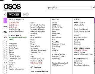
I think these work well as mock ups as it is important to show where these products would be sold and how you go about accessing them. I think that is the most important factor, how can men and women jump straight into their gender specific product, by the different tabs. And what other products can they expect to be buying alongside that that is targeted towards their gender. Of course this is ridiculous, but I feel borne from my research that if we do not question it, is the way things will go.  - synthesis These types of sites will become more gender segregated like clothing websites such as Asos where you have a man's and women's section. 


THE PROBLEM
The only problem with all of this, is that it took way longer than I expected it to take! It took like 2 days all in all to edit everything… which is a time waster.. 

Practical - Printed posters & Boxes


I am pleased with the outcomes however there are things I can improve
  • the stock of the boxes - print them on glossy card instead
  • the size of the posters, bigger scale to get a better idea of the context they would be in
  • I am really debating whether I would have been better off adding colour, but the idea was to focus on everything else other than colour. 


Wednesday 6 January 2016

Practical - Photographing products

Setting up in studio 


THE PROBLEM
I am really bad at photography. I would not have a clue how to properly set up a studio as I have not done this since my induction

THE SOLUTION
 I asked photography student Hannah Kin-Han Voong to help me make some product shots. Mostly to help me set up in the studio because it had been a long time since I'd done it. This gave me a better understanding of how to do it in the future. 

THE PROBLEM
We initially thought a black back drop would work best against the white box, however, when we shot it they came out extremely dark and the box looked like it was floating.. not good


THE SOLUTION
I then went and bought some grey paper and thought this may work better, I thought white again would make it look like it was floating or the box would get lost into the background. 
Grey worked much better. However, I wasn't happy with how the products were getting shot I had to keep changing the position of the box, something just wasn't working, it didn't look professional enough. 

We tried a lot of different angles, close ups, birds eye view, head on and then I could later go through and pick which work best. 

As I needed some for a banner on the website, some for mock ups, and some just to act alone as the toothpaste box on the toothpaste section of the website there had to be different view points. I figured it may be a case of editing them in Photoshop and cropping for certain images.


For the ones that were to be used just head on of the toothpaste for the toothpaste section I decided to shoot those on white because I wouldn't need a shadow for them. However, there wasn't much difference between that and the grey, so they would need editing in Photoshop.


I shot a couple of the boxes together as well


Overall, for my first time at product shooting I think it went okay (i'm no graphic designer) but after looking at the images, it wasn't completely the look I was going for. Hopefully working with product more in the future I'll get a better idea of it and perhaps get more advice from graphic designers as to the type of angles that look good. Also, I had to edit the photos a lot to get rid of some of the edges because I hadn't stuck them down very well, the double-sided tape was coming away and this showed up like a sore thumb in the product shots. They also looked a little dirty against the white background… thank god for photoshop. 


Practical - Poster - femitooth

Contextual References

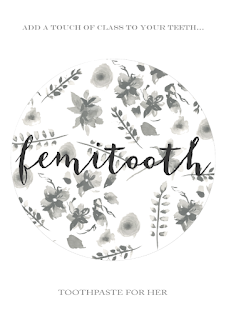
I was really struggling to come up with an idea for this one, because I never seem to create 'feminine' delicate work, so I don't know how to promote it properly either. I looked at some perfume ads for influence because they often use floral patterns to represent the perfume petals. I found some that I thought worked well because they were just plain and simple, and I decided to try create something really simple myself as this may have the  most impact against quite a busy design on the box. I would still need to incorporate flowers somehow, but not as 'in your face'. I was really tempted to add colour and just add colour to my nets because it was such a challenge not to, but I stuck with black and white.


I started off playing around with how I could make a shape with the flowers 


As they were still pretty bold I changed the opacity so that the text would stand out on top of it. 
I tried different background colours and thought I did quite like this grey I think white was more effective. 


Compared to the male poster this one was to have hardly any text on it, but I still had to show what the product actually is, so I thought perhaps I would include the 'toothpaste for her' somewhere. It was too light to put inside the circle so it would have to be elsewhere on the page. I really battled with this though, it just wasn't working compositionally. I added a slogan at the top to try balance it out, but still something wasn't right. 


I thought of perhaps adding one of the flowers really faded in the background too which was nice behind the text but just didn't work well for a poster.


Played around with the size of the circle and the text… still wasn't happy, it didn't say advertisement to me, looked more like a logo. 

THE PROBLEM
The circle has no relevance to the product, no relevance to anything really I just thought it looked good. Perhaps that was the problem

I went back to the drawing board by including the original floral design to make it busier and played around with how I could arrange the text within that. 


I was getting really frustrated by this point. Why couldn't I make a poster? I decided to go back again and look at contextual references to try get some influence. 

I really liked the idea of using floral photography around the product. However, as I hadn't included a product shot in the male poster I felt that I couldn't really include it on this one, but I could use the logo?


I started to collage in some grey and white roses around the logo 


I then layered them all along the centre of the page so that it wasn't completely busy and filled the page, but it had a focal point. I added a rectangle breaking up the flowers for the logo to exist in. 
I tried out some different colours for this.


It still wasn't working, so I decided that perhaps it was the logo being in the centre, and that instead I should include an anecdote and let the logo exist elsewhere. I tried this and really liked it  :


For me, it was beginning to look more like a poster. More of an advertisement. But the slogan wasn't quite right. 


It was all 'too' feminine and it wasn't funny, I didn't think people would get my whole point. I am trying to mock these types of advertisement, I am mocking gender biased advertisement, so I need to continue to mock it somehow. 

And voila : 


It's crude, its offensive, but it mocks these kind of ads which is what I wanted to do. 
I did realise though when I was in print, that I'd wrote the wrong flavour down. Ginger and Cinnamon? No idea where that came from. It's Cinnamon & Peppermint.. So I had to change it last minute! 


Stock

Wasn't sure which paper to print on because I thought with toothpaste being something that's liquidised and it is a feminine advertisement then perhaps it should be on glossy, but when I asked my peers they said matte. I decided to just go with glossy and one matte to see which worked best. When printed, glossy works best for the context and when I asked my peers again they agreed - follow your instincts!