Contextual References
I was really struggling to come up with an idea for this one, because I never seem to create 'feminine' delicate work, so I don't know how to promote it properly either. I looked at some perfume ads for influence because they often use floral patterns to represent the perfume petals. I found some that I thought worked well because they were just plain and simple, and I decided to try create something really simple myself as this may have the most impact against quite a busy design on the box. I would still need to incorporate flowers somehow, but not as 'in your face'. I was really tempted to add colour and just add colour to my nets because it was such a challenge not to, but I stuck with black and white.
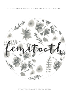
I started off playing around with how I could make a shape with the flowers
As they were still pretty bold I changed the opacity so that the text would stand out on top of it.
I tried different background colours and thought I did quite like this grey I think white was more effective.
Compared to the male poster this one was to have hardly any text on it, but I still had to show what the product actually is, so I thought perhaps I would include the 'toothpaste for her' somewhere. It was too light to put inside the circle so it would have to be elsewhere on the page. I really battled with this though, it just wasn't working compositionally. I added a slogan at the top to try balance it out, but still something wasn't right.
Played around with the size of the circle and the text… still wasn't happy, it didn't say advertisement to me, looked more like a logo.
THE PROBLEM
The circle has no relevance to the product, no relevance to anything really I just thought it looked good. Perhaps that was the problem
I went back to the drawing board by including the original floral design to make it busier and played around with how I could arrange the text within that.
I was getting really frustrated by this point. Why couldn't I make a poster? I decided to go back again and look at contextual references to try get some influence.
I really liked the idea of using floral photography around the product. However, as I hadn't included a product shot in the male poster I felt that I couldn't really include it on this one, but I could use the logo?
I started to collage in some grey and white roses around the logo
I then layered them all along the centre of the page so that it wasn't completely busy and filled the page, but it had a focal point. I added a rectangle breaking up the flowers for the logo to exist in.
I tried out some different colours for this.
It still wasn't working, so I decided that perhaps it was the logo being in the centre, and that instead I should include an anecdote and let the logo exist elsewhere. I tried this and really liked it :
For me, it was beginning to look more like a poster. More of an advertisement. But the slogan wasn't quite right.
It was all 'too' feminine and it wasn't funny, I didn't think people would get my whole point. I am trying to mock these types of advertisement, I am mocking gender biased advertisement, so I need to continue to mock it somehow.
And voila :
It's crude, its offensive, but it mocks these kind of ads which is what I wanted to do.
I did realise though when I was in print, that I'd wrote the wrong flavour down. Ginger and Cinnamon? No idea where that came from. It's Cinnamon & Peppermint.. So I had to change it last minute!
Stock
Wasn't sure which paper to print on because I thought with toothpaste being something that's liquidised and it is a feminine advertisement then perhaps it should be on glossy, but when I asked my peers they said matte. I decided to just go with glossy and one matte to see which worked best. When printed, glossy works best for the context and when I asked my peers again they agreed - follow your instincts!


No comments:
Post a Comment