Web pages
I decided to go with Boots as a store where these products would be sold because I wanted somewhere that was mainstream enough that buying these products would become the norm and become a 'trend' if you will, but also the products are quite illustrative and current so I wanted somewhere that sold brands that were quite original. I was thinking of Urban Outfitters or Harvey Nichols, somewhere quite specific to the audience of these products but then I figured if my concept is saying that this will become the norm and the future then it would have to be a mainstream company. I think that it made sense to represent these on a site like Boots as opposed to a supermarket like tesco because of the price of them, they would be priced pretty high in comparison to other toothpaste brands.
I wanted to mock up some web pages of where you would find the products online. I wanted again for this to be gender specific, expanding on my research into the psychology of market layout. I think that in the future this will be something that is explored further with gender specific sections online in main supermarkets and stores. - synthesis In order to do this I would need one male webpage, and one female webpage. This is to show that you would go to your gender specific section for certain products. For example as a woman you would click on the womens tab which would then take you to cosmetics, make up, perfume, etc. Men equally would click on the men's tab which would take them to aftershave, electrical, toiletries and so on. I wanted to then show how the product would be advertised on this page alongside other brands.

I took a screenshot of the boots website that had female products on it, then used the pattern above by Cathy Nordstrom down the sides to make it look more feminine.
Cathy had a lot of nice feminine patterns that I liked
I used this web template to then paste the web design inside of
I tried out different patterns for the sides that were feminine but decided to stick to my original idea by Cathy of 'Pine Collection' because for me it said 'Boots' more and I could imagine them actually using this design.


I done the same for the mens, screenshotting the Boots website page and then adding my own text and photographs to these.


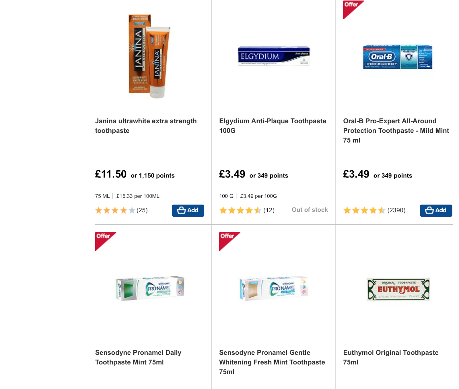
I wanted a page that was souly toothpaste to show that the brands could be sold alongside other mainstream toothpastes and if you searched for toothpaste in the search bar then the product would still show up rather than just in the men/women's section.
This would influence the way that I edited my photographs of the boxes, as these were floating on white I needed to do the same with my images.

For the male background I created that myself because I wasn't happy with any designs online I simply made a grey background and added navy pinstripes as this is a rather masculine pattern and the navy would still tie into boots. For the banners I used my birds-eye photography which I edited in photoshop and played around with lightening. For the toothpaste tube I deleted the background completely and put it against white. I added a little 'new' icon to the top left of the product also where originally boots had 'offer' symbols, to show that this is a new upcoming trend.


I think these work well as mock ups as it is important to show where these products would be sold and how you go about accessing them. I think that is the most important factor, how can men and women jump straight into their gender specific product, by the different tabs. And what other products can they expect to be buying alongside that that is targeted towards their gender. Of course this is ridiculous, but I feel borne from my research that if we do not question it, is the way things will go. - synthesis These types of sites will become more gender segregated like clothing websites such as Asos where you have a man's and women's section.

THE PROBLEM
The only problem with all of this, is that it took way longer than I expected it to take! It took like 2 days all in all to edit everything… which is a time waster..
No comments:
Post a Comment