1st Design - Completed
This was mocking how toy stores brand and manufacturers are creating and advertising toys that are gender biased therefore subconsciously moulding young children into these categories.
I wanted to use old fashioned font and clothing to highlight how these attitudes of sexism are old fashioned but still occurring today (hence the modern toy).
2nd Design - Completed
I think the little boy on this piece still looks really modern alongside the toy he is playing with but the colours I used and the font highlight an earlier era yet again so I quite like that mix.
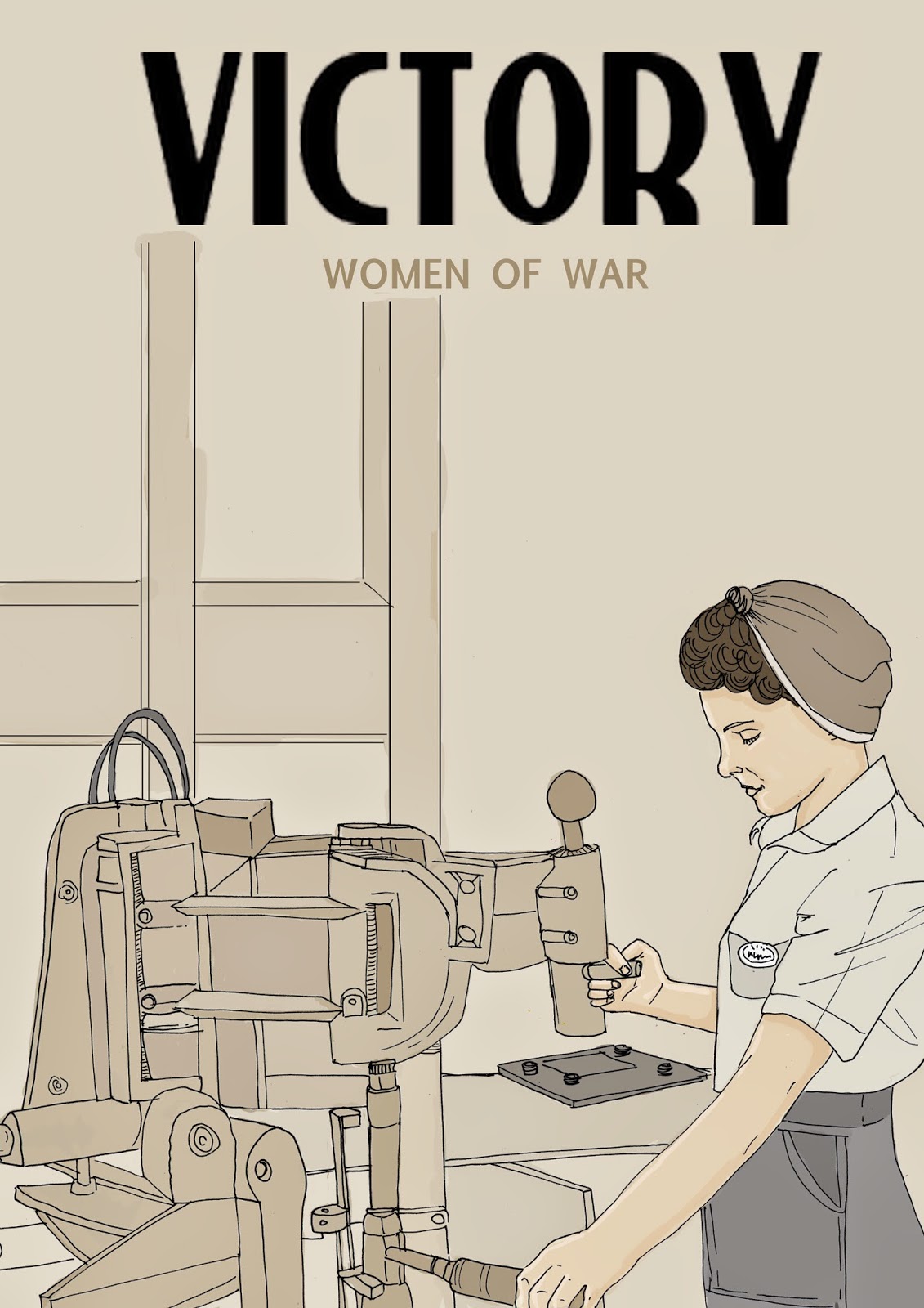
3rd Design - Just needs tidying up
My idea was to take the victory posters and show a woman at work instead of dominant males. It's the idea that that is the real victory.
I started off with this design and I initially was just going to colour the female and leave the rest as line work but I began to just add darker shades of the background colour and eventually came up with a nice mix. I used a Photoshop font initially but then after showing my peers they recommended searching a font website for vintage fonts. I searched for 1940s fonts and came to a site where there were more fitting styles. I really liked one so I downloaded it but could not open it in Photoshop. I had to just print screen it and layer it on but the quality is not very good, I need to look into this further.
Almost done just needs a little bit of tidying up. I've seen others in my class replicating these kind of styles and it is something I have never explored before but I am really enjoying. Definitely something I will consider more in the future because it gives the work more clarity, especially the font.
 4th design - Completed

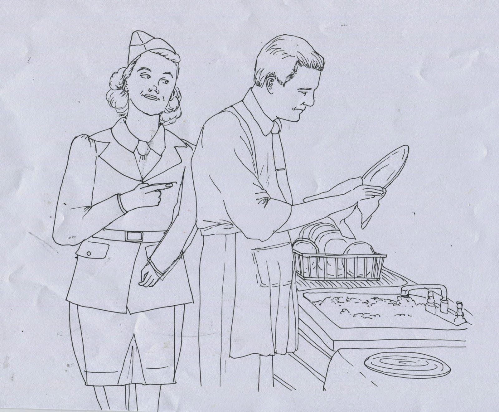
I came across various 'My Home' posters and magazine covers when researching into 1940s housewives; all of women looking proud and posing against their furniture. I'd like to show a stay at home dad, tied to the sink with the same title. These women look really house proud and are so exaggerated. I will use the original posters as my influence for colour palette. For the text I will just use something off Photoshop for this one because they have a lot of calligraphic styles. It will be interesting to see how my illustrative style works alongside these images as they won't be as life-like.
Final design
I am not sure whether my illustrative style works with this piece but I enjoyed creating it. I think it is quite a humorous contrast and something you definitely would not expect to see on the front cover of a magazine or a poster, even today. One day hopefully that will change.
5th idea
These posters really made me laugh, 'She may look clean' but she is riddled with all sorts of diseases, warning men to keep away from women incase they infect them. I'd like to show a charming, handsome man with the same slogan to warn away women. Diseases can be spread by both genders not just by women. It is an equal choice; yet women are being made out to be the 'good time girls' luring in men, as if they are dangerous and men have no other choice but to be victimised.
6th idea
'They depend on you' already gives woman a sense of strength as a professional role of nurse in the war, but we don't see many imagery of male nurses at that time. Certainly not on posters or campaigns so I would like to explore this and switch the gender roles once again. The females in the image are always looking extra beautiful and happy despite a pressurised job so will be interesting to see a male looking just as corny!
-
7th idea
I like how the food adverts were linked with the war back then, like you had to be a big tough guy just to eat some nestle. It seems that all adverts were aimed towards the war. All adverts were also gender specific. When has food ever been for a certain gender other than Yorkies? I'd like to turn the man into a woman of war, a really young woman, I wonder if it would have had the same impact back then? If the woman is really young, almost a child, it mocks how nestle uses their food with violent connotations.
8th idea
My 8th idea is to use a woman in the army as the ' Your Country needs you' posters to persuade women to get involved rather than males. Or even to persuade men to still get involved, but would they if the message came from a woman? Follow me! Is a command, follow me, do as I do..
A possible 'back up' idea
If one of my other ideas is not working or I find time to explore this one I like the idea of the prostitute posters where men had to say no to women incase they gave them an STD. I would like to switch this on it's head and have men lurking on the corner like the 'good time girls' were.
I think my work has a clear sense of direction now; compared to when I first started generating my ideas with the Lad Culture sketches. I think these designs will sum up more the idea of gender roles and equality, highlighting women to be 'dominant' and males as 'passive.'
I am unsure whether they work as a series as they are all so different, but they are supposed to be mocking posters of the 1940s onwards to highlight an old fashioned attitude that is still relevant today. This links nicely to my essay because I feel that modern culture is going back over in a sense; welcoming a gap once again in gender.
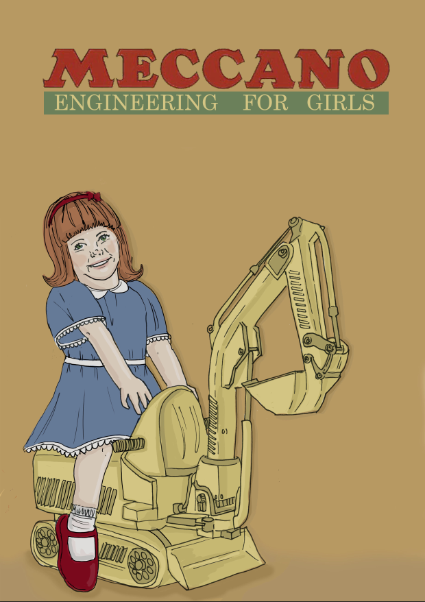
Meccano - re-edited fisher price piece
Syphillis poster development
I used this image of a 1940s man to inform my colour palette
I attempted to replicate the 'he may look clean - but' type as a diagonal across the page but it just did not match well with my style of illustration
Final image
Nurse development
I decided this font was not working so I used the original font.
Something wasn't quite working with this, I had to refer back to the original to see what I was missing. I added another mutiply layer of colour.
It still looked too slick, and the original was really grainy. I looked into some brushes and found one that I multiplied over in a grey. This worked really well and I am so pleased
I may try it out with all of them to see if they make them look more old
Nestle development
Influenced by the end image of this sequence as reference
Final design


